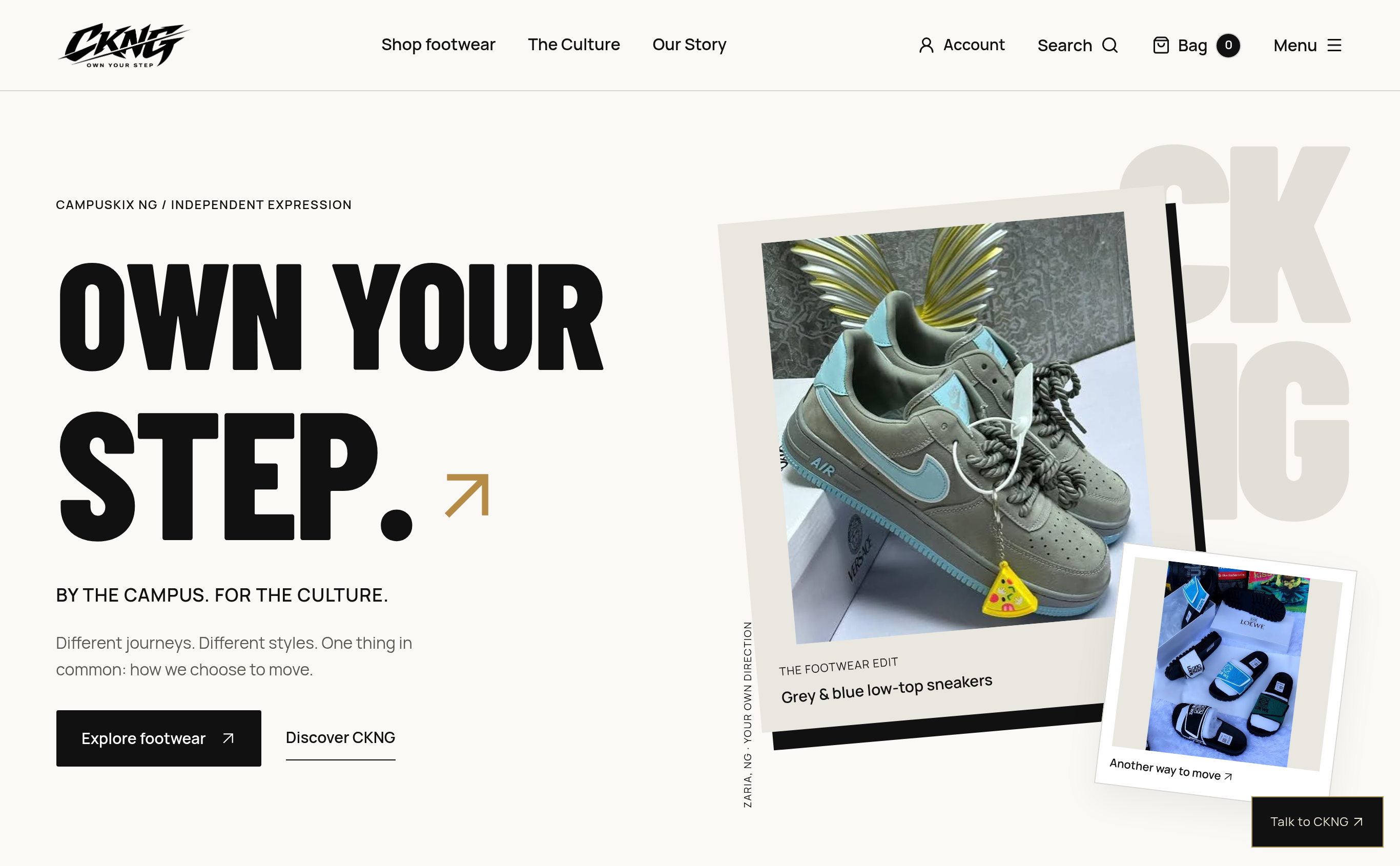
The opening composition places “Own your step” beside a framed footwear edit, introducing the brand’s direct voice and layered editorial imagery.
Footwear belongs to familiar routes, shared places and the small choices that make a day feel like your own. CampusKix NG brings that everyday perspective into a bold digital identity: rooted in Zaria, open to individual expression, and held together by one invitation — own your step.
More than a product grid.
CampusKix NG presents footwear through the lens of campus culture and personal direction. The introduction pairs a direct invitation with product imagery and a concise statement of identity: “By the campus. For the culture.” It gives the collection a setting before asking visitors to explore it.
That sense of place matters to the character of the experience. Zaria appears as a point of origin in the brand story, while the language leaves room for different journeys, styles and ways of moving. The site has a recognisable perspective without prescribing a single kind of customer.
Loud type. Quiet space. Room for the product.
Heavy, condensed headlines set the pace. Warm off-white surfaces, black lettering and muted neutral accents give the photography space to carry its own colour. Fine rules and compact navigation provide a calmer frame around the larger statements.
The hero treats the product image like an editorial object: a tilted photograph, a printed caption and a second image layered into the composition. Paper-like borders and oversized background lettering introduce movement while keeping the footwear central. A restrained gold arrow adds a small directional accent.
Give each pair its own place.
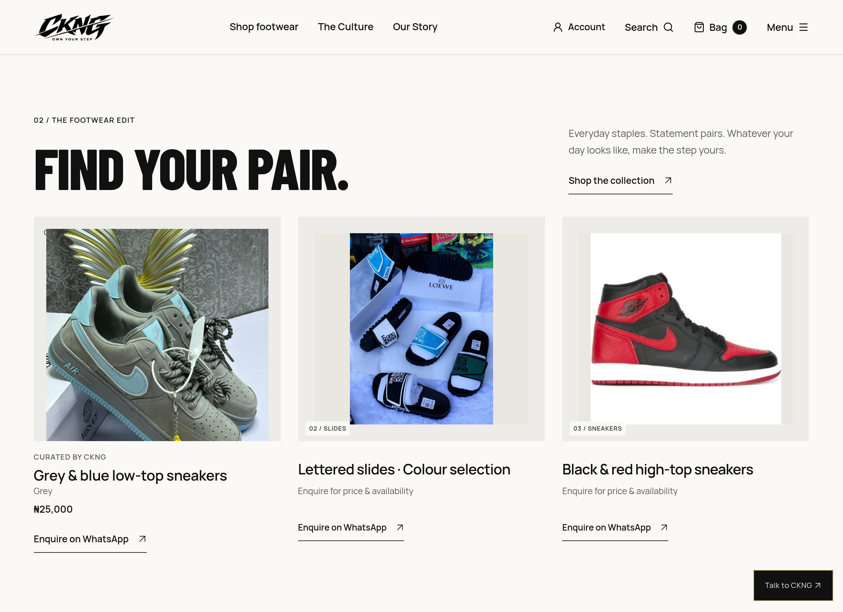
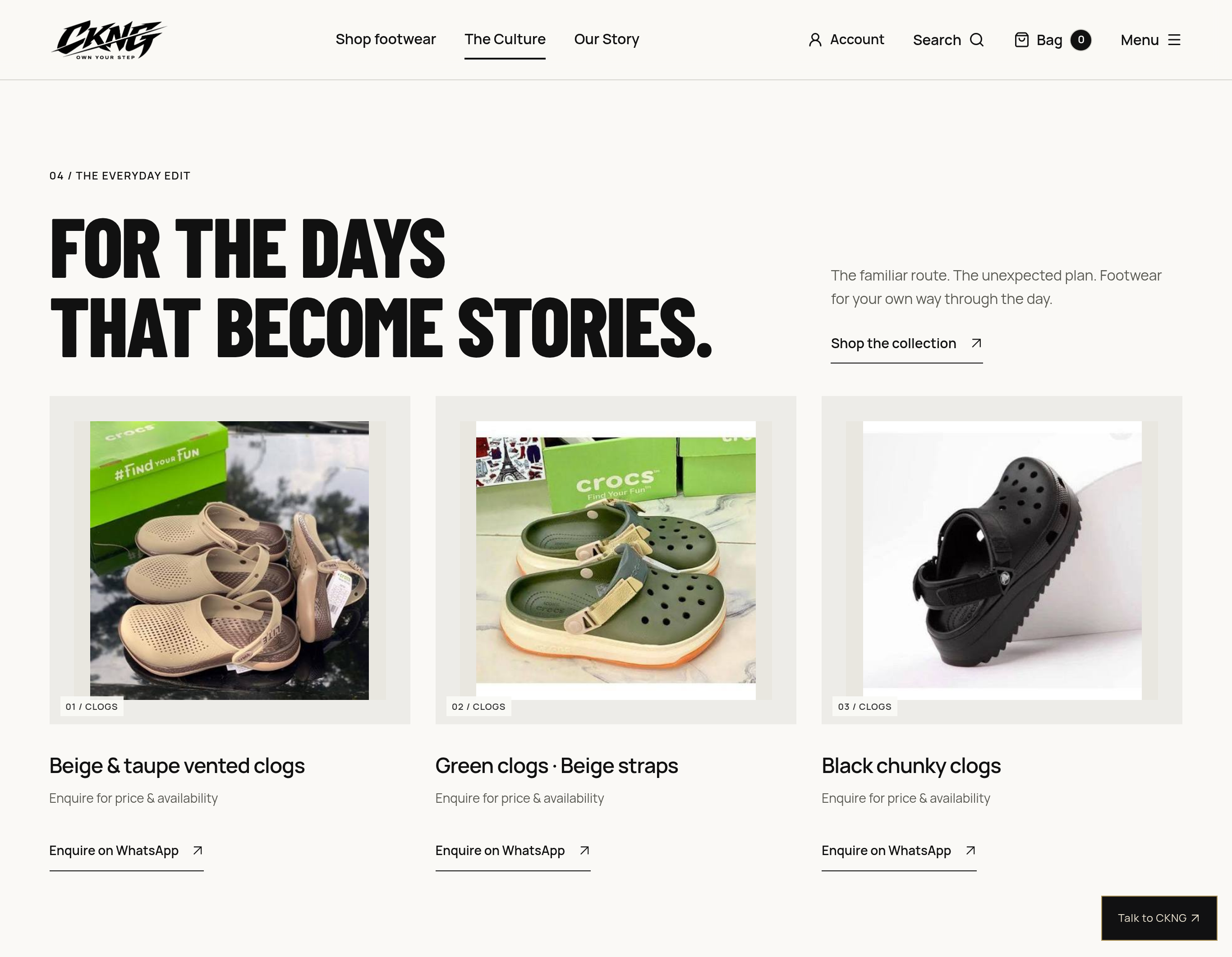
The collection is organised into clear cards, with generous image areas and descriptive product names. Grey-and-blue low-top sneakers, a selection of slides and black-and-red high-tops each receive their own visual space. The clogs edit repeats the same structure for different colours and silhouettes.
Category labels, names and pricing or availability cues sit close to the relevant image. This creates a useful reading order: recognise the pair, understand the description, then find the next action. The photographs remain part of a coherent collection while retaining the texture of the original product imagery.
From a pair you notice to a conversation you can start.
The product controls make the enquiry route visible within the collection. WhatsApp is named directly beside the footwear, and cards that invite a price or availability enquiry communicate that next step in plain language.
This is a practical part of the design story. A visitor can browse the visual edit and identify a specific pair before reaching out. The surrounding copy keeps the invitation short and consistent: explore footwear, find your pair, enquire. Product information and the route to contact belong to the same reading flow.
A strong point of view should make the next step clearer.
A campus is a shared way of moving.
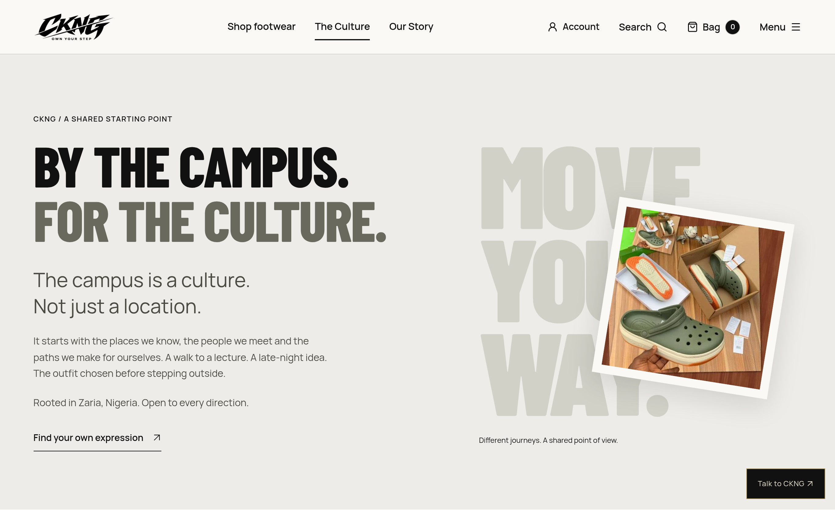
The culture section broadens the story beyond the catalogue. It draws on familiar moments — the walk to a lecture, a late-night idea, the outfit chosen before stepping outside — to explain the brand’s point of view.
A framed product photograph sits against oversized “Move your way” lettering. The composition connects the expressive visual language of the hero with a more reflective passage of copy. Campus culture becomes a source of tone, references and everyday context across the experience.
A point of view, expressed in a consistent voice.
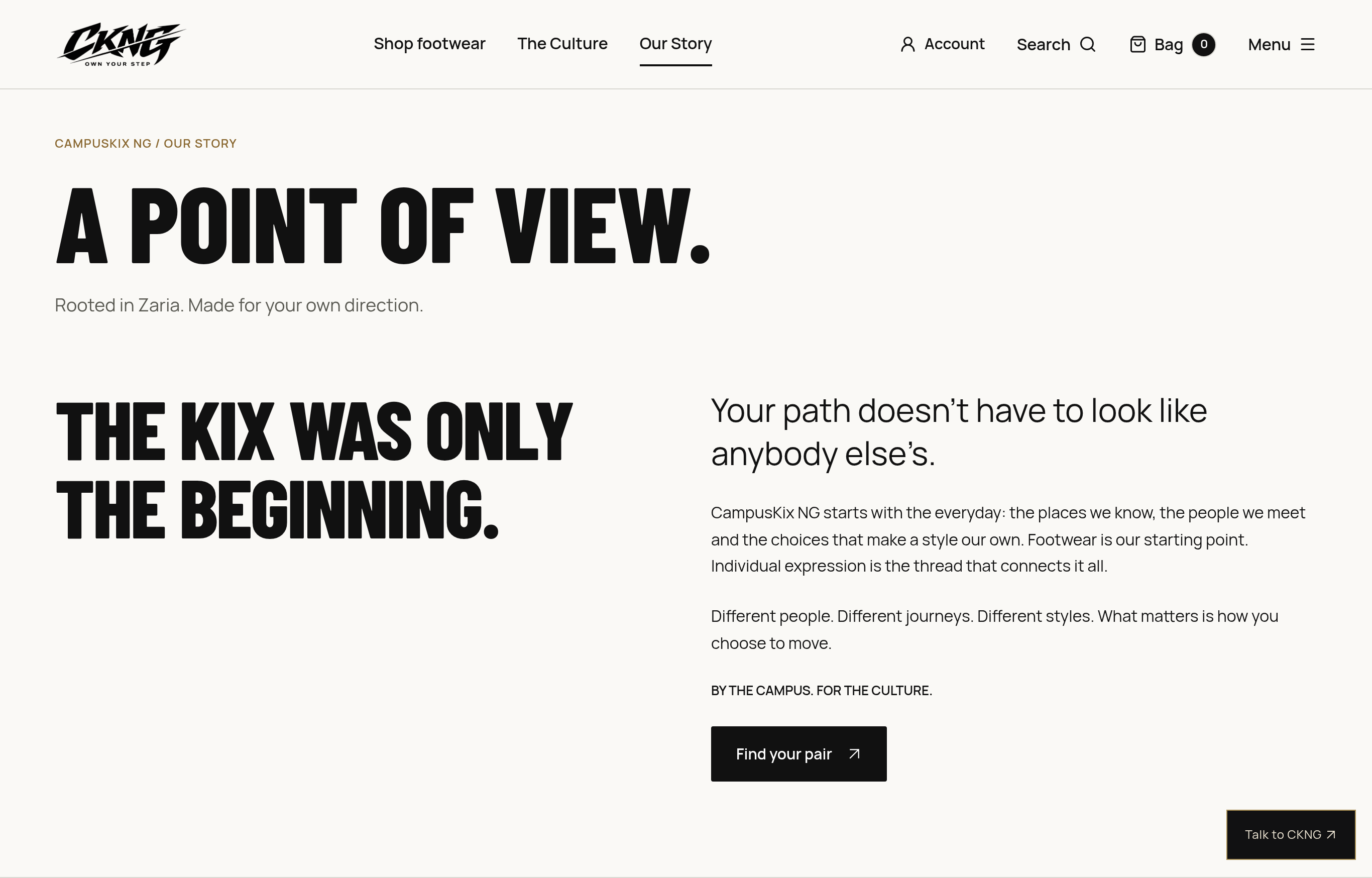
The story page continues the same direct style with “A point of view” and “The kix was only the beginning.” Large statements are balanced by quieter paragraphs about individuality, everyday places and choosing a direction of your own.
The writing gives the product-led pages a companion narrative. “Own your step” can describe a footwear choice, a personal route or a wider sense of expression. That flexibility lets the central idea recur across the site without requiring every section to say the same thing.
Keep the useful details in the same frame.
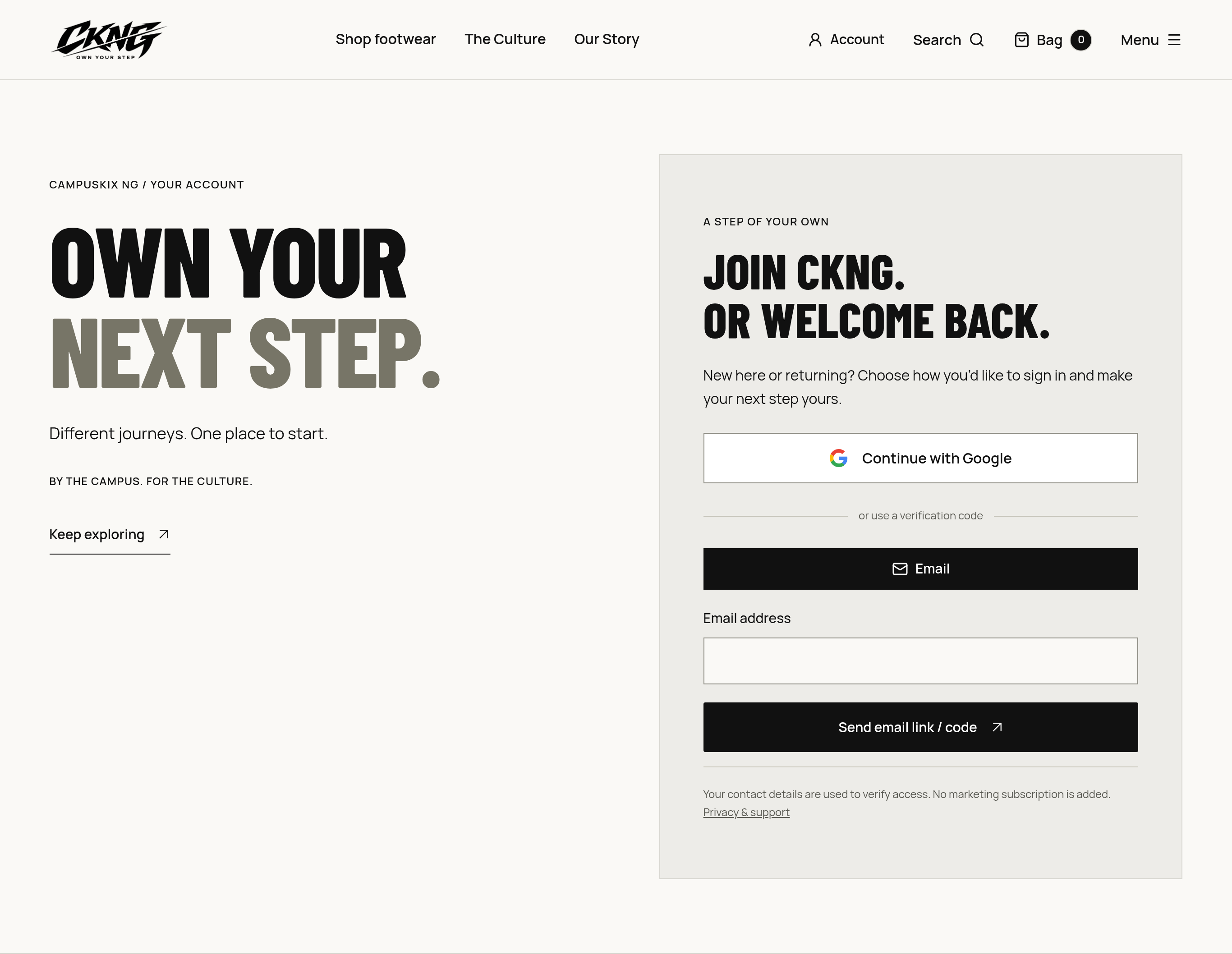
Account, search and bag controls sit alongside the primary footwear, culture and story navigation. Their placement gives shopping utilities a clear place within the wider identity rather than leaving them visually detached from it.
The account view carries the bold headline treatment into another part of the experience. Its visual language connects the product-led pages with the wider shopping navigation: the same typography, spacing and directional details continue beyond the landing page.
A clear identity. An equally clear invitation.
Across the interface, product, place and personality share a consistent visual language. Editorial image frames make the footwear recognisable; concise descriptions give it context; repeated controls keep the next step visible.
CampusKix NG offers a useful design lesson: a strong point of view can carry through the practical parts of an interface. The most considered moments are the ones where the brand’s voice and the visitor’s next action feel like parts of the same experience.
Step into CampusKix NG.
Explore the footwear, the culture and the story at CampusKix NG ↗
Explore the concept demonstration
Explore the CampusKix NG — Own Your Step demo (opens in a new tab)