Two product worlds. One clear introduction.
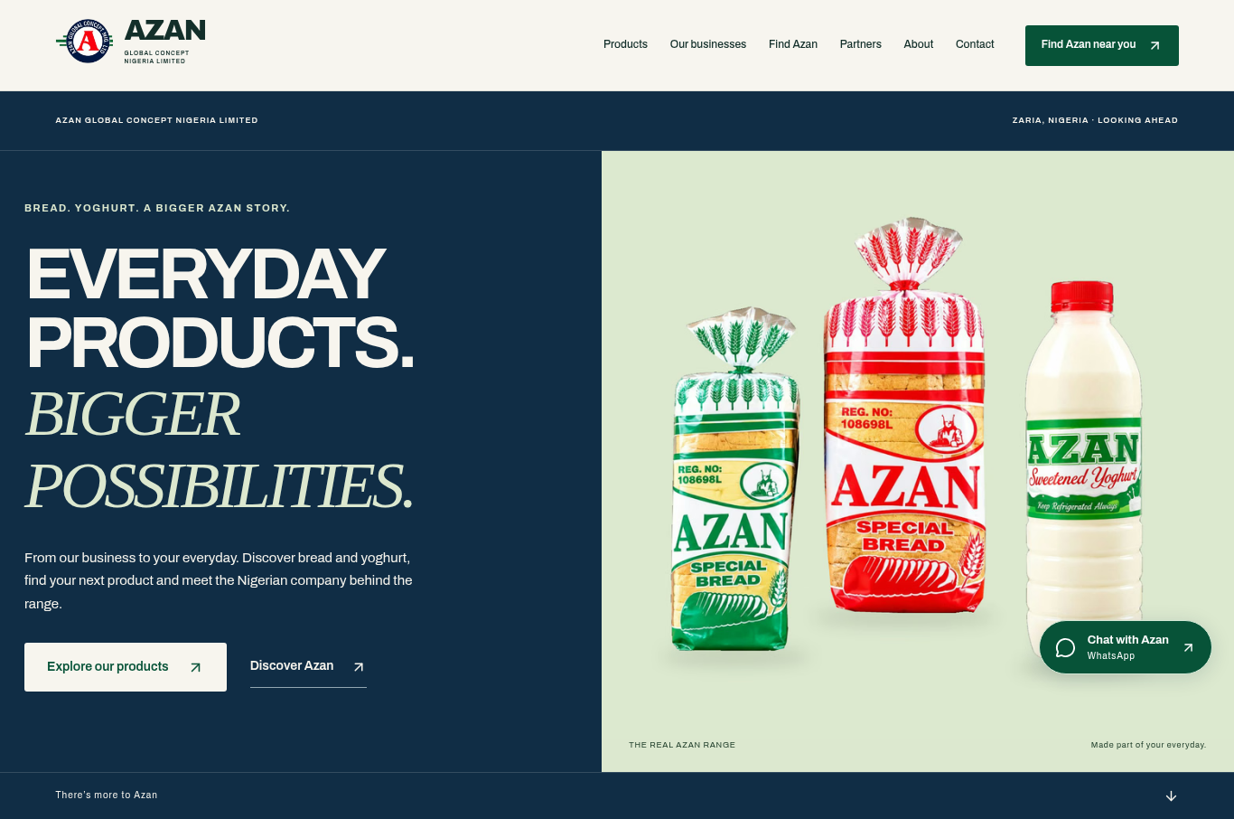
Azan's website brings bread and yoghurt into one recognisable digital experience. The homepage's split composition, shown in the cover image, gives both product worlds a place through photography, clear category cues and a considered balance of type and space.
The website connects that opening introduction with product browsing, company information and clear routes to location details and product enquiries.
Keep the brand coherent and the choices distinct.
Bread and yoghurt share a brand, but they need their own visual space. A coherent website has to hold those differences together while helping a visitor understand what is available and where to go next.
Bread and yoghurt, distinct by design.
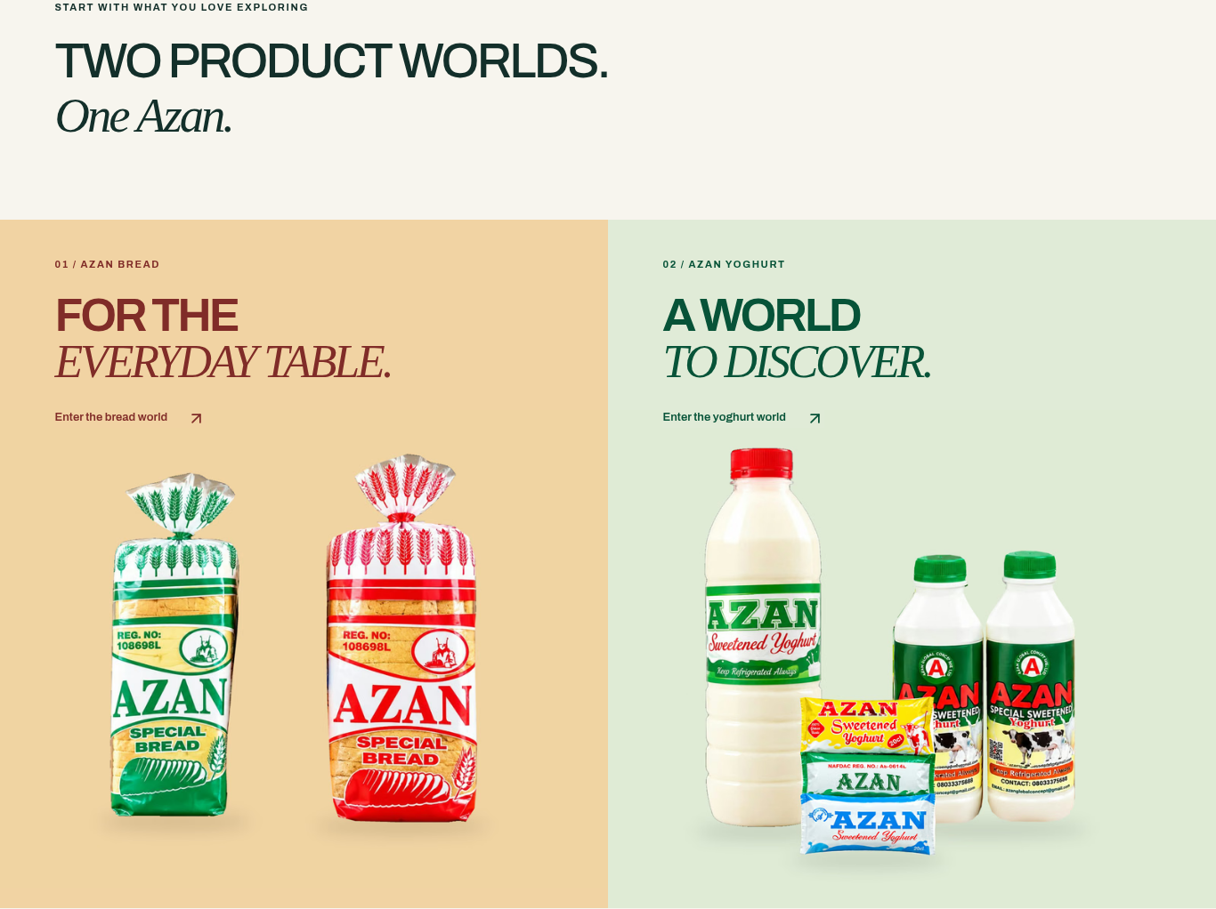
The two-worlds section makes that distinction explicit. Rather than compressing everything into one uninterrupted product grid, the composition gives each category a clear introduction within the same design language.
Three questions organise the journey.
The visible page structure supports three straightforward questions: what does Azan make, where is the business based, and how can I make an enquiry? Product sections, a dedicated Find Azan area and an enquiry flow give those intentions distinct places on the website.
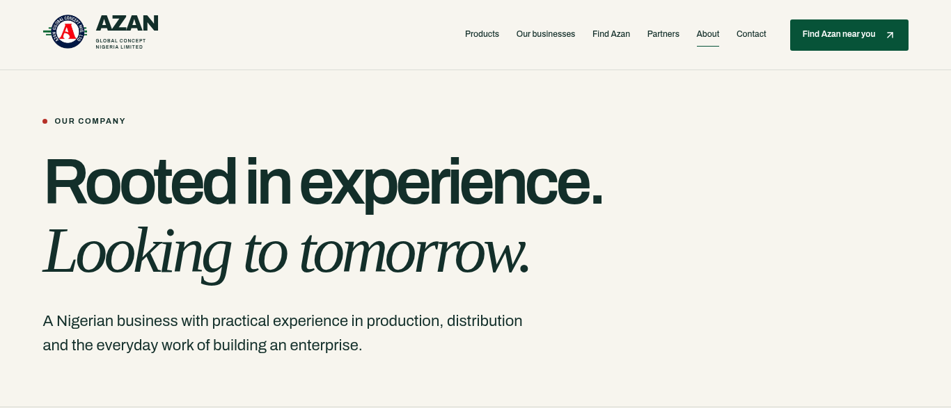
Company information provides another layer of context for visitors who want to understand the business behind the products. This combination gives the site room to introduce the brand while keeping practical information within the wider journey.
Warmth in the palette. Precision in the hierarchy.
Brand character beyond the homepage.
Cream backgrounds create a warm setting for the product imagery. Navy gives the experience structure, while forest green adds another point of recognition across the page family. The palette connects the product-led sections with the more practical company and enquiry pages.
A clear sans serif carries navigation, labels and supporting information. Italic serif accents bring character to selected phrases and headings. The contrast lets the site move between expressive brand moments and information that needs to be read quickly, without changing its visual identity.
Give every product format a place.
A clear overview of the range.
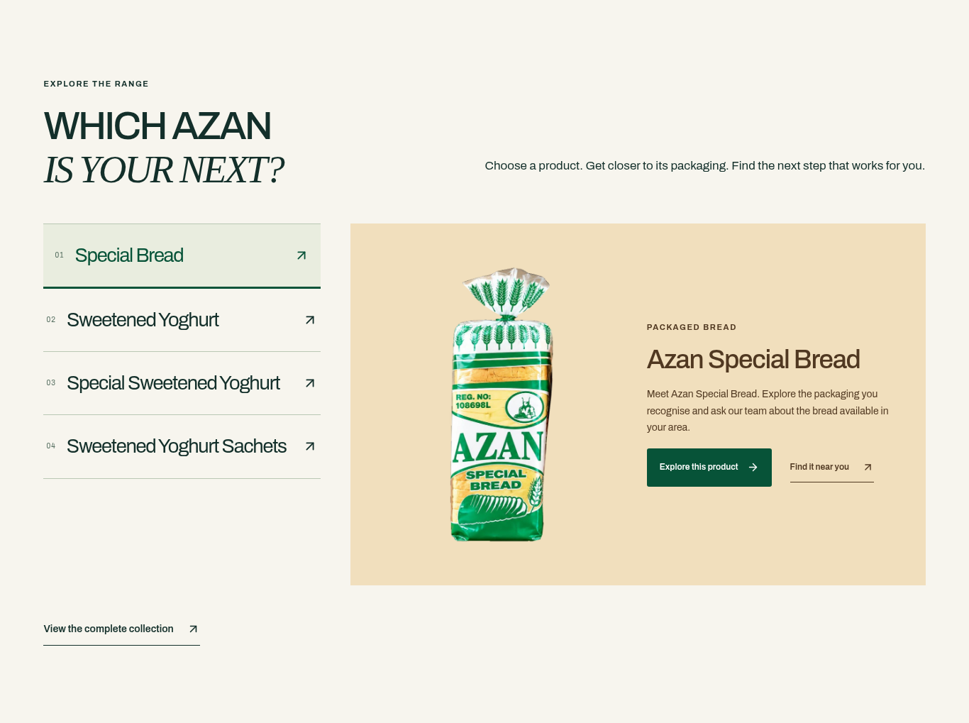
A vertical category selector sits to the left of a larger product panel. The selected bread view gives the product room to lead, while the category choices remain visible beside it. The composition keeps the range and the selected product in the same frame.
Bottles and sachets, clearly distinguished.
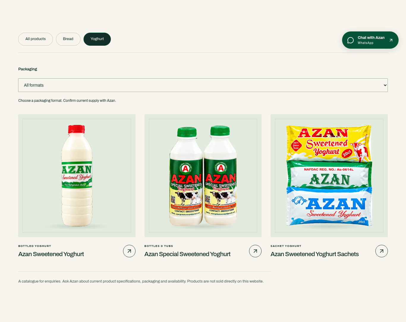
The yoghurt cards then bring individual formats into focus. Bottles and sachets are presented as distinct options, with product imagery doing much of the explanatory work. Consistent card treatment keeps those differences readable within one collection.
An invitation to explore the gallery.
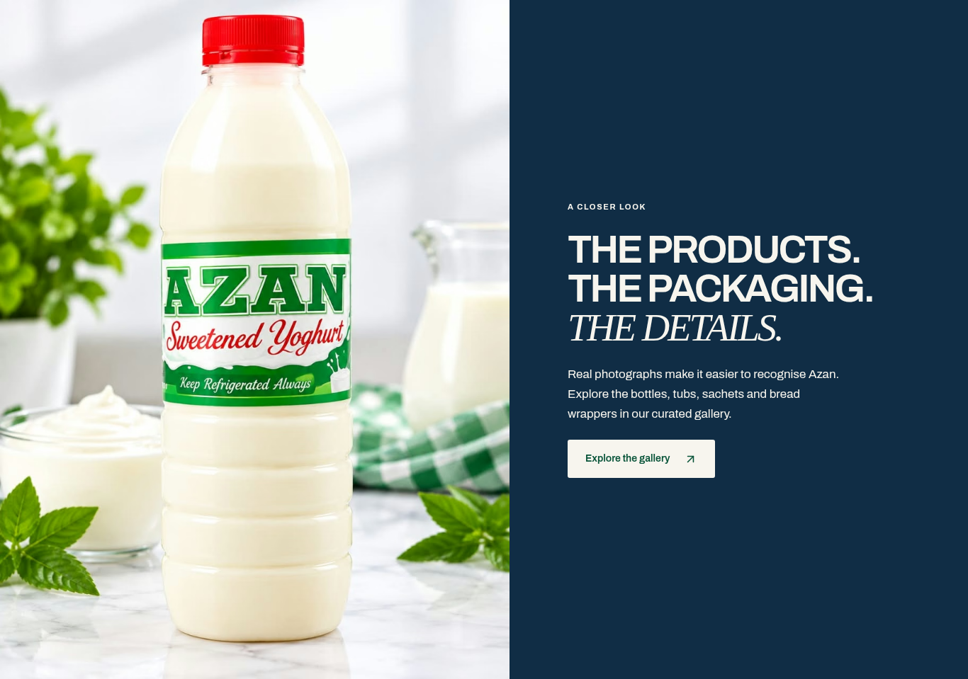
The gallery invitation pairs a full yoghurt photograph on the left with a navy copy panel and an Explore the gallery call to action on the right. It offers a route to more imagery through a composition that keeps the product itself in focus.
Move from interest to practical information.
A dedicated destination for finding Azan.
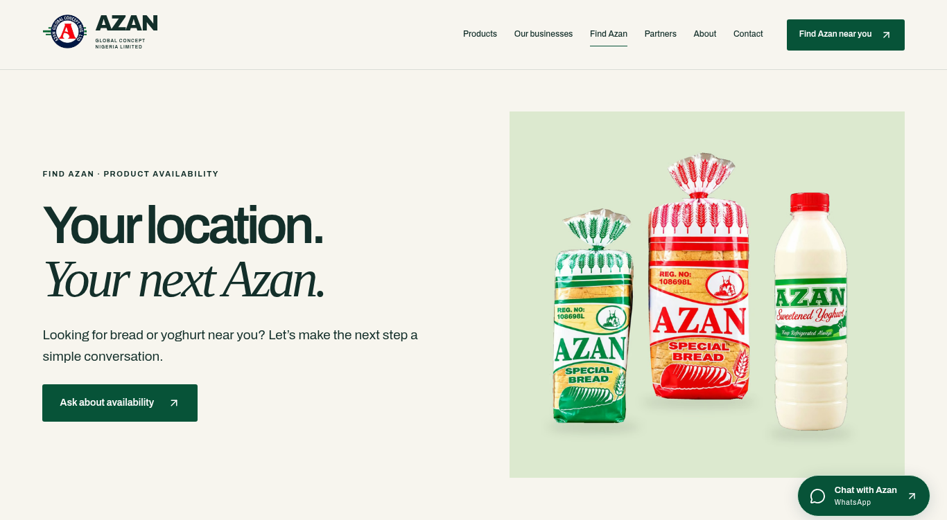
The Find Azan area gives practical information a dedicated destination. Its product-led introduction keeps that part of the experience connected to the main website rather than treating location details as an unrelated utility page.
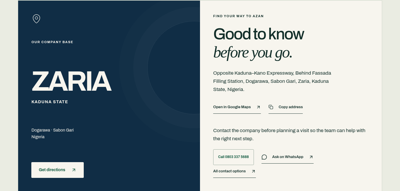
Zaria, in one practical view.
The Zaria panel presents Azan's company base, bringing its address and contact information into one readable group. This establishes where the business is based and how a visitor can contact it, alongside the wider product and enquiry information.
Make the first enquiry more specific.
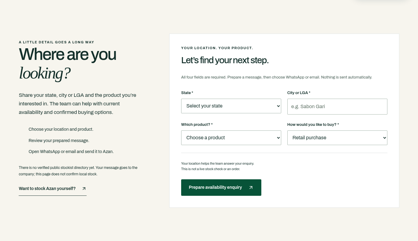
A prepared enquiry, with the visitor in control.
The enquiry flow asks for state, city, product interest and purchase details, then prepares a message for the visitor to review. The information has a clear purpose: describe the request before choosing how to send it.
The visitor reviews the prepared message and chooses WhatsApp or email to continue. Nothing is sent automatically. Stock availability and order confirmation remain part of a subsequent conversation, keeping the interface clear about the step being taken.
Give common questions a clear home.
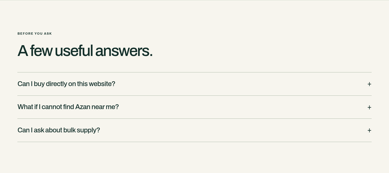
Practical questions, clearly grouped.
The FAQ section adds a dedicated place for practical questions within the Find Azan experience. Its question-led layout separates these details from the more expressive brand and product sections.
This is a useful complement to the enquiry route: visitors have somewhere to look for information before deciding what they still need to ask. Keeping those answers accurate remains part of maintaining the website.
A connected website experience.
The website brings together a coherent family of pages: a brand introduction, distinct product worlds, a product range, company context, location information and a structured enquiry form. A consistent visual system connects these different purposes.
The work is visible in the relationship between those parts. The opening introduces the offer; the product sections make room for detail; the location and enquiry areas give that interest somewhere practical to go.
A clear next step, from first screen to final invitation.
Three ways forward, in navy.
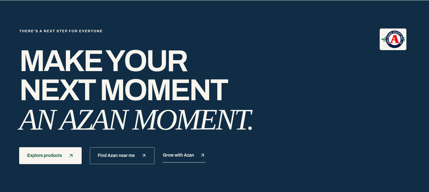
The closing navy section offers three clear routes: Explore products, Find Azan near me and Grow with Azan. Its contrasting colour and typographic hierarchy carry the visual identity through to a final choice of next steps.